A small incident recently prompted me to write this article.
One late night, I was already in bed, just wanting to open the Midea Smart Home App to turn off the air conditioner.
But the moment the app launched, it was like turning on a floodlight—the bright interface was almost blinding in the dark room.
That’s when I realized: We’ve gotten used to system-wide dark mode, but many apps are still stuck in “daytime.”
Ironically, my own website didn’t support dark mode at first. It took quite some effort to adapt it, and only then did I truly appreciate it as a basic courtesy.
So I started to think:
What problem is dark mode really solving? Why are people increasingly relying on it?
This article analyzes the logic behind this seemingly “simple” UI design from the perspectives of visual comfort, psychology, product experience, and development practice.
It’s Not a “Trend”—It’s a Return to Human-Computer Interaction Roots
Many people see dark mode as a “recently popular UI style.”
But in fact, dark interfaces were the default in the earliest human-computer interactions—we later “switched” to light styles.
| Era | Features |
|---|---|
| CRT Era | Black background with green text (Terminal, DOS) |
| GUI Era | Switched to white background, black text—“like paper” for readability |
| Early Mobile OS | iOS and Android defaulted to light interfaces |
| 2018–2019 | macOS/iOS/Android introduced system-wide Dark Mode |
| Now | IDEs, AI tools, tech sites default to dark mode |
In other words, dark mode isn’t a “trend”—it’s a reasonable interaction method rediscovered in the digital age.
Why Do More Users Actively Switch to Dark Mode?
Today, the first thing many people do with a new device is: Switch the system to Dark Mode.
Breaking down this phenomenon reveals several common needs.
| Aspect | Description |
|---|---|
| Visual Comfort | Dark backgrounds reduce light stimulation, ease eye strain, especially at night |
| Focus | Dark mode minimizes decorative elements, focusing attention on content |
| Energy Saving (OLED) | OLED black pixels don’t emit light, so dark themes save power |
| Aesthetic Trend | Dark is more minimal, techy, and mainstream in tech circles |
| Circadian Rhythm | Bright interfaces at night disrupt body rhythms; dark mode is friendlier |
In a sense, dark mode is a respect for users’ mental state in digital interfaces.
Two Real Scenarios: Why I Realized “It’s Essential”
Let me share two real scenarios that triggered this article—one from user experience, one from developer experience, both illustrating the same point.
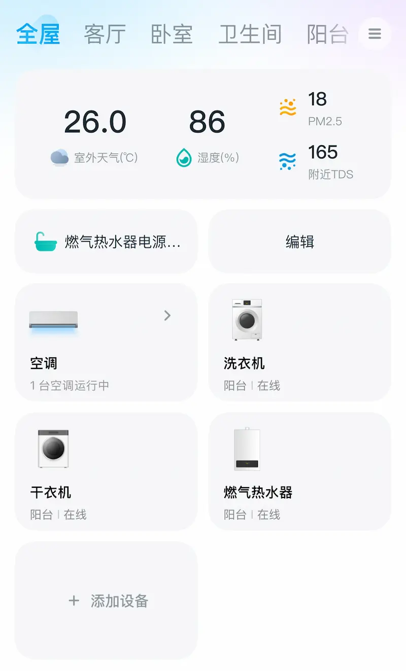
Using Midea Smart Home App at Night
The moment you open the app, the bright interface lights up the whole room.
You just want to turn off the air conditioner, but you feel “forced awake”—a very jarring experience.
That’s when I realized dark mode is the minimum courtesy for nighttime interaction.
Adapting My Hugo Website to Dark Mode
My website used to have only a light theme; many people said it was “too bright” for night reading.
I thought adapting dark mode would be a “small tweak,” but it turned out to be a complete design system overhaul.
Once it went live, I found I could never go back to light mode.
Why Do Some Apps Still Not Support Dark Mode?
Many ask: If users need it so much, why do some apps (like Midea Smart Home) still not support it?
The reasons are practical—dark mode is hard to add as a “bolt-on” feature.
| Reason | Explanation |
|---|---|
| No Design System | Early UIs hard-coded colors, making theme switching impossible later |
| High Dev Cost | Requires a whole new set of colors, icons, and states |
| Double Testing | Light + dark means two complete test flows |
| Low Priority | In feature-driven teams, visual optimization is often deprioritized |
From Product Experience: It’s Not Just “Prettier”—It’s “Polite”
Especially at night, users are in low-light, relaxed states.
If an app still uses a large bright interface, it disrupts the user’s rhythm.
Dark mode ≠ Premium feature
Dark mode = Basic respect for user environment and feelings
Especially for home, sleep, and health apps—most usage happens “off work hours,” and bright interfaces almost “fight the user.”
Developer Perspective: Adapting Dark Mode = Small Design, Big Engineering
I felt this firsthand when revamping my website:
Adapting dark mode isn’t just “changing colors”—it’s a full theme architecture overhaul.
| Item | Actual Issues Encountered |
|---|---|
| Color Vars | Rebuilding color system for light/dark switching |
| Icons/Images | Images readable in light mode may be invisible in dark mode |
| Code Blocks | Two sets of highlight themes needed |
| System Pref | Respond to prefers-color-scheme |
| Theme Templ | Original theme hard-coded colors, requiring style refactoring |
Typical Cases: Why Do Tech Products Prefer Dark Mode?
You’ll notice almost all new tech tools use dark as the default, not just an option.
| Site/Product | Features |
|---|---|
| Vercel Website | Default dark, minimal and professional |
| Linear | Dark is part of brand identity, enhances focus |
| Raycast | High contrast, efficient and tool-like |
| ChatGPT (Web) | Recent versions default to dark, light is secondary |

Summary
- Dark mode isn’t just “prettier”—it has clear visual, psychological, and experiential advantages;
- For nighttime or high-focus scenarios, it’s actually a basic interaction courtesy;
- Some apps haven’t supported dark mode not out of ignorance, but due to architecture and high cost;
- For developers, adapting dark mode is a “long-term benefit”—once done, the product’s overall feel improves instantly;
- If light mode represents “information density,” dark mode embodies “rhythm and restraint.”